A better way to create Charts for SURVEY RESULTS in EXCEL
Master Excel Formulas in 72 hours ➡️ https://www.udemy.com/course/100excel... Maste Excel VBA: ➡️https://www.udemy.com/course/vba-cour... --------------------------------------------------------------------------------------------------------------------------------------------------------------- In this lesson, I want to show you how to create Charts for SURVEY RESULTS in EXCEL. You will learn a new type of chart to display survey results. With a few tricks, you will improve the quality of the discussion around the data you have collected. Channel content: Excel, excel tutorial, Microsoft excel, learn excel, how to use excel, excel basics, basic excel, ms excel, office 365, excel for dummies, excel functions, learn excel basics, microsoft excel for beginners, excel course, Mr Excel, excel help, microsoft excel tutorial, excel tricks, excel tips, excel guide, how to in excel, tricks in excel, tips and tricks, pivots tables, excel formulas, advanced techniques for excel. #Excel #MsExcel #Chart


How to analyze data in Excel for Likert Scale Questions | Create graphs for likert scale questions

How to tabulate, analyze, and prepare graph from Likert Scale questionnaire data using Ms Excel.

Diverging Bar Charts for Likert Scale Survey Questions

Avicii, Dua Lipa, Coldplay, Martin Garrix & Kygo, The Chainsmokers Style - SUMMER DEEP HOUSE Mix

Best of 80s Music Legends - Tears For Fears, Madonna, Cyndi Lauper, Modern Talking, Michael Jackson

How to make bar charts more interesting in excel

TypeScript in Express – TypeScript Tutorial
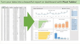
Introduction to Pivot Tables, Charts, and Dashboards in Excel (Part 1)

Plotting Likert (agree/disagree) data in Excel

Master Data Analysis on Excel in Just 10 Minutes

The best way to analyze LIKERT SCALE and INTERPRET the results

Make Impressive McKinsey Visuals in Excel!

Bar chart with differences in Excel
![Pictogram Charts in Excel: Add Icons to Bars [Rounded + Dynamic]](https://i.ytimg.com/vi/8g9DK5noi1s/hqdefault.jpg?sqp=-oaymwEjCNACELwBSFryq4qpAxUIARUAAAAAGAElAADIQj0AgKJDeAE=&rs=AOn4CLD1WmtuOe_aEcEEKDMcvDQGePgR8Q)
Pictogram Charts in Excel: Add Icons to Bars [Rounded + Dynamic]

Data Visualization: Nested Pie Charts in Excel

Musica para trabajar activo y alegre - Música Alegre para en Tiendas, Cafés | Deep House Mix 2026

777 Portal ✨ Manifest Miracles, Abundance & Divine Alignment - Meditation Music

Charting Survey Results in Excel (Visualize Employee Satisfaction results)

Will the Iran end the US Empire?
