How to Create a Combination Chart (Combo Chart) in Excel | Use of Secondary Axis | MS Excel Part 157
Learn Combo Chart or Combination Chart in Excel step-by-step in this detailed tutorial of our complete Excel course, MS Excel Part 157. In this video, you will understand what a Combo Chart in Excel is, why it is used, and how it helps you compare different types of data effectively using multiple chart styles and a secondary axis. Whether you’re comparing sales + profit margins or percentages + absolute values, this guide shows you how to build professional, clear combo charts that impress. What you will learn: ✔️ What is a Combo Chart in Excel? ✔️ Why and when should you use a Combo Chart? ✔️ Real-life examples of Combo Charts in Excel ✔️ Understanding the purpose of the Secondary Axis ✔️ How to display different data scales using a Secondary Axis ✔️ How to change chart types for different Data Series ✔️ How to combine Column, Line, and other chart types in a single chart ✔️ Tips and tricks to create professional-looking Excel charts If you enjoyed this Funnel Chart in MS Excel tutorial, make sure to 👍 Like, 🔔 Subscribe, and share this video with friends who want to master Excel Charts. 🎥 Continue Your Excel Learning: ✅ Free Excel Tutorial: • Free Excel Tutorial | MS Excel Tutorial fr... ✅ PivotTable Tutorial: • Free PivotTable Tutorial | Master Excel wi... ✅ Pictures in MS Excel: • 📊 Mastering Pictures in MS Excel – Complet... ✅ MS Excel Chart Tutorial: • Excel Chart Tutoral 🟢 MS Excel Tutorial Playlist https://mrcodings.com/ms-excel-tutorial ----------- 🔵 MS Word Tutorial Playlist https://mrcodings.com/ms-word-tutorial ------------- 🟢 Tally Tutorial in Gujarati • Tally Tutorial in Gujarati ------------- Our 🧒📘 FaceBook / mrcoding33 ------------- Our 📷 Instagram / mrcoding33 ------------- 🔵 Join Our Telegram Channel https://t.me/mrCoding33 ------------- 📞 Join Our WhatsApp Channel https://mrcodings.com/WhatsApp ------------- Official 🌐 Website https://mrcodings.com ------------- #Excel #ComboChart #ExcelChart #MSExcel #ExcelTutorial #LearnExcel #MrCoding #MSExcelPart157 #CombinationChart


Every Chart Type Ranked — What to Use and What to Avoid

Axes Element in Excel Chart | Horizontal and Vertical Axis | Bounds & Tick Marks | MS Excel Part 158

MS-EXCEL-155: How to Create Waterfall Charts in Excel | Waterfall (Bridge) Charts from Scratch

Microsoft Excel 2021/365 Tutorial: 3.5+ Hours of Advanced Excel Training Course

Beautiful Relaxing Music - Stop Overthinking, Stress Relief Music, Sleep Music, Calming Music #177

40Hz Binaural Gamma Waves - Ultra Deep Concentration
![Data Modeling for Power BI [Full Course] 📊](https://i.ytimg.com/vi/MrLnibFTtbA/hqdefault.jpg?sqp=-oaymwEjCNACELwBSFryq4qpAxUIARUAAAAAGAElAADIQj0AgKJDeAE=&rs=AOn4CLASQdyWMIppxB5x-w51fuei9wE8xw)
Data Modeling for Power BI [Full Course] 📊

Abstract Black and White wave pattern| Height Map Footage| 3 hours Topographic 4k Background
![PINK & ORANGE GRADIENT IN HD [3 HOURS]](https://i.ytimg.com/vi/6ih8zppfQSQ/hqdefault.jpg?sqp=-oaymwE9CNACELwBSFryq4qpAy8IARUAAAAAGAElAADIQj0AgKJDeAHwAQH4Af4JgALQBYoCDAgAEAEYfyAsKBMwDw==&rs=AOn4CLDvw6mQM98bfl572zfE7r4GdUG8dg)
PINK & ORANGE GRADIENT IN HD [3 HOURS]
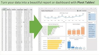
Introduction to Pivot Tables, Charts, and Dashboards in Excel (Part 1)

But what is quantum computing? (Grover's Algorithm)

Pawel Czerwinski | Abstract Art Slideshow for your TV | 1hour of 4K HD Paintings

Stop Sending Ugly Pivot Tables to Your Boss

Funnel Chart in Excel | How to Change Shapes and Colors in a Funnel Chart | MS Excel Part 156

Beautiful Relaxing Music - Stop Overthinking, Stress Relief Music, Sleep Music, Calming Music #242

TV Art | Boho Neutral | Frame TV Screensaver | Smart TV Background Art | 2 Hours | 4K UHD

The Aero Arcology - Aero Ambient Music for Focus & Clarity

Aesthetic Aura Background 3 hours

Learn Power BI in Under 3 Hours | Formatting, Visualizations, Dashboards + Full Project
